MIFO – Website
Created at Kaboom communication design in 2014 with WordPress
To better serve its client base and improve its notoriety regarding a number of its activities, the Mouvement d’implication francophone d’Orléans (MIFO) moved to completely revamp its brand image and website early in 2014.
The organization had attribution issues regarding some of its services, which led to developing a new, more encompassing visual identity, while the new website would provide more accurate and better-organized information, especially for those searching for activities.
My Role for this Project
- Content strategy
- UX design
- UI design
The Results
- An online presence more in line with the organization’s brand image
- A better-organized and more user-friendly website, easier to browse and search through
Content Strategy
The MIFO wished to have the existence of certain events and activities attributed to them, especially regarding youth programs (daycare, summer camps), in order to solidify their reputation all across their range of services. They were already well-known for cultural activities, but the public didn’t relate to the organization for educational and community-related events.
This need would of course influence the development of their new brand, but would also impact the website’s content structure, pushing content relating to education and community to a higher level, right alongside cultural events, which people associated to the MIFO.
The MIFO’s new website would benefit from a more intuitive content structure, divided in sections corresponding to the organization’s great areas of expertise.
UX Design
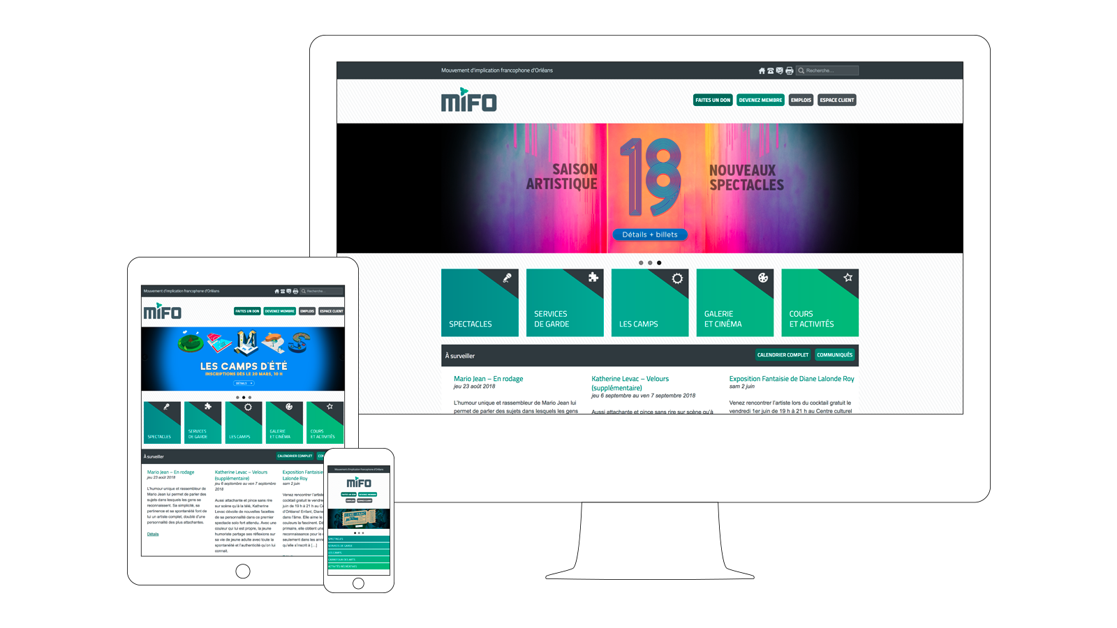
The main navigation menu needed a complete overhaul, as the previous website’s navigation was confusing. It needed to be clearer and simpler to avoid confusion. This led to having all five (5) main sections of the website (shows, daycare, summer camps, gallery and cinema, courses and activities) appear at top level in the main menu. Note that the menu isn’t featured on the site’s home page, against all recommendations.
Live shows being to this day the driving force behind the MIFO’s ability to reach its audience, they are promoted on a wide array of pages throughout the site, to try and create a cross-browsing experience for users whose original intent wasn’t related to cultural events, but whose interest might be kindled by being presented with opportunities to assist to live events.
Certain lists and many content types’ individual pages (shows, exhibits, movie showings) hold a number of informations visually organized in order to be easily absorbed in a wink, making those pages more efficient by the clever use of icons and variations in font size.
Call to action buttons at the top of the site allow for easy access to secondary, although important content, such as information regarding membership or donations.
UI Design
The website’s user interface was created according toguidelines stemming from the previously created wireframes. It uses a number of shades of green coming from the visual identity as complementary colours. Those also act as reminders of the MIFO’s franco-Ontarian origins.
The font used for titles and call to action buttons is Titillium, which is similar to the one used to create the MIFO’s logo, although it isn’t exactly the same, for reasons of versatility.