Cliona Derma – Website
Created at Kaboom communication design in 2017 with WordPress
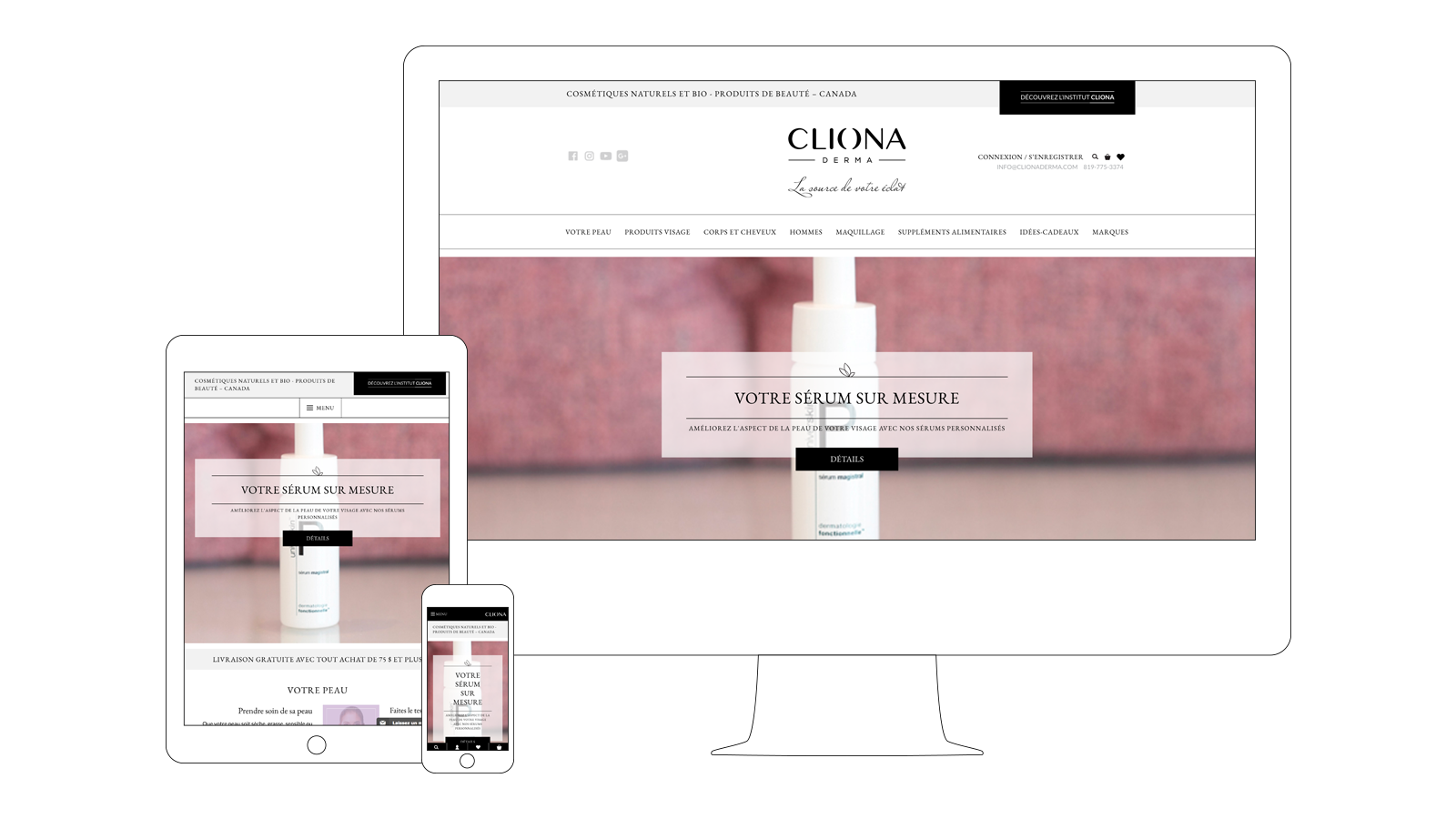
Both an aesthetics clinic and an actual store, Cliona Derma wanted to enter the e-commerce game by getting their hands on a transactional website that would allow them to reach a much larger audience for their high-end products.
Going from an actual store to an online commercial platform meant to attract visitors without being able to assist them in person would prove to be an interesting challenge.
My Role for this Project
- Content strategy
- UX design
- Development planning and management
The Results
- Over 60 seconds spent on average on product or product category pages
- Only 17% exit rate on product or product category pages compared to overall 31% exit rate
- Visitors spending over 3 minutes and 30 seconds on the site on average
- 60% of visits coming from organic search results
- 57% of visits made from a mobile device or tablet
Content Strategy
A simple online store wasn’t going to be enough for Cliona Derma, who wanted its online visitors to go through the same type of experience they would if they were to visit its actual, physical store. Certain features would have to be implemented in order to advise clients of the website on how to choose the right products for their skin type.
A blog, aptly name “The Science”, was to feature posts detailing the grand principles behind cosmeceuticals, showcasing specific products. This would create reciproqual links between the posts, whose social sharing and indexing values were high, and product pages, who were to be designed to reach high-conversion rates.
In a similar fashion, adding recommended products according to a user’s skin type, which they were going to be able to save by creating their profile and going through a quick online test, and creating ingredient pages were going to add even more opportunities to consistently drive website visitors to a new page, regardless of their original intent.
A loyalty program, advertised both online and in-store to convince existing clients to buy from the website, was going to be a driving sales force right from launch time, aided by the fact one would be able to buy products from the site as a guest, without having to create a profile. The creation of a profile was to be promoted, as it would allow users to save their skin type and only view products specifically recommended for them, as well as repeat orders, given the prominence of recurring purchases in the cosmetics and beauty products industry.
UX Design
The cosmetics industry being driven by brand power, which this client would confirm given their experience with their traditional store, it would prove crucial to allow visitors to shop by brand. Those brands were to find themselves at the top of the list of available filters when searching products and would hold a place in the main navigation menu, at the same level as product categories, allowing visitors to instantly view two different types of product lists in a single click.
Options for filtering and sorting products would obviously be available to users, some being more traditional (filter by price range, sort by name or brand, etc.), others being more closely related to the nature of the products and clients. It was going to be possible to view products according to their efficiency for certain skin types, to their composition (whether any ingredient would be used in said product or not) or to certain ethical considerations.
Creating a profile, filling in certain informations and going through a quick skin-type test would allow logged-in users to have products pre-filtered for them when visiting the site, to avoid being presented with items containing an ingredient they’re allergic to or simply not suited for their skin type, for example. This was meant to recreate the kind of experience one would go through when walking into the store and being guided through their purchase by an actual person.
The way recommended products would be shown in blog posts and as related products in individual product pages would be very similar, creating obvious comparisons between the online store and the blog, both of which would see their content promoted in different ways (organic search, SEO and SEM for the one, social media and sharing for the other). This would create an opportunity to drive visitors looking primarily for information to the online store.
Lastly, as Cliona Derma’s brand wasn’t known outside of its local environment, emphasis was to be put on the security of the purchase process, which also had to be intuitive and user friendly. The checkout steps were going to be clearly identified and visual cues would allow any user to easily figure out what was going on, leaving nothing to chance.
Development Planning and Management
- Development of the structure of content types
- Planning of interactions (user-interface and content-type-to-content-type relations)
- Planning of functionalities
- Supervision of development (identification of tasks, identification of milestones and quality control)